4. Distribution Plot
Let’s use a different plotting style, bmh.
[1]:
%matplotlib inline
import matplotlib.pyplot as plt
import seaborn as sns
import numpy as np
import pandas as pd

plt.style.use('bmh')

np.random.seed(37)
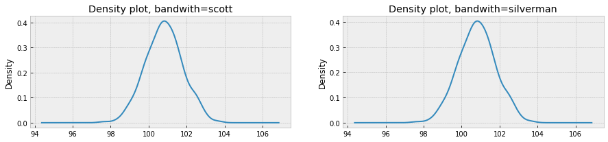
4.1. Basic
Here are two basic density plots using different bandwith methods.
[2]:
sigma = 1.0
mu = 100.8

x = sigma * np.random.randn(1000) + mu
s = pd.Series(x)

fig, ax = plt.subplots(1, 2, figsize=(15, 3))

_ = s.plot(kind='kde', bw_method='scott', ax=ax[0])
_ = s.plot(kind='kde', bw_method='silverman', ax=ax[1])

_ = ax[0].set_title('Density plot, bandwith=scott')
_ = ax[1].set_title('Density plot, bandwith=silverman')
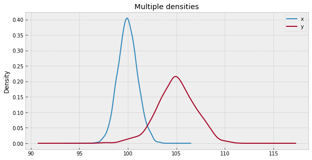
4.2. Multiple densities in a single plot
Multiple densities in a single plot may be achieved through Pandas dataframes.
[3]:
df = pd.DataFrame({
    'x': 1.0 * np.random.randn(1000) + 100,
    'y': 2.0 * np.random.randn(1000) + 105
})

fig, ax = plt.subplots(figsize=(10, 5))

_ = df.plot(kind='kde', ax=ax)
_ = ax.set_title('Multiple densities')
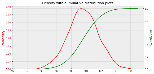
4.3. Density with cumulative distribution plot
This plot overlays density and cumulative plots using Seaborn.
[4]:
sigma = 1.0
mu = 100.8

x = sigma * np.random.randn(1000) + mu

fig, ax1 = plt.subplots(figsize=(10, 5))

_ = sns.kdeplot(x, ax=ax1, color='r', label='density')

ax2 = ax1.twinx()

_ = sns.kdeplot(x, ax=ax2, cumulative=True, color='g', label='cumulative')

_ = ax1.set_ylabel('probability', color='r')
_ = ax2.set_ylabel('cumulative', color='g')

_ = ax1.tick_params(axis='y', labelcolor='r')
_ = ax2.tick_params(axis='y', labelcolor='g')

_ = ax1.legend().set_visible(False)
_ = ax2.legend().set_visible(False)

_ = ax1.set_title('Density with cumulative distribution plots')
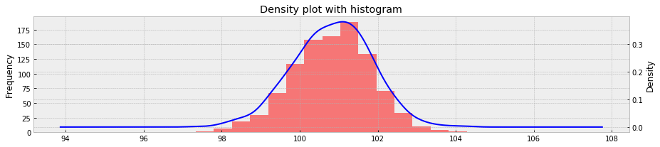
4.4. Histogram overlay
[5]:
sigma = 1.0
mu = 100.8

x = sigma * np.random.randn(1000) + mu
s = pd.Series(x)

fig, ax = plt.subplots(figsize=(15, 3))

ax1, ax2 = ax, ax.twinx()

_ = s.plot(kind='hist', bins=15, alpha=0.5, color='r', ax=ax1)
_ = s.plot(kind='kde', bw_method='scott', color='b', ax=ax2)


_ = ax.set_title('Density plot with histogram')